Landing Page PACK
Here we made a set of sliders which you can use to easily create landing pages for your site. This collection is special, because all of them contains 1 slide, so-called blocks, which can be the perfect elements of a one-page site. These block elements are quite useful, because the texts can be changed easily to your own one within minutes. The sliders will only start when they arrive into the viewport, so it will give you the feeling like the whole page is being built right now, in front of you.
Different parallax effects are also enabled for these sliders, which helps you to highlight the relevant message of your site.
When you are creating such a page, or a one-page site, you should keep in mind that the elements must be in harmony, their design and animation easings, and you should avoid the sudden moves or unexpected happenings. The point of the fluid animations and feeling is that you should choose similar easings for the different layer animations, and the direction should be also like the others.
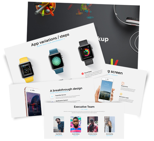
Landing Page - Block elements
Intro Slide
This slider is a good start for agencies, to show main activites, portfolios, or even contact informations. It uses the "outline" skin, and a delayed parallax on scroll effect. On the slides, the layers have different parallax-levels, so you can see that the layers can slide over each other by scrolling the page.
Landing Screen 2
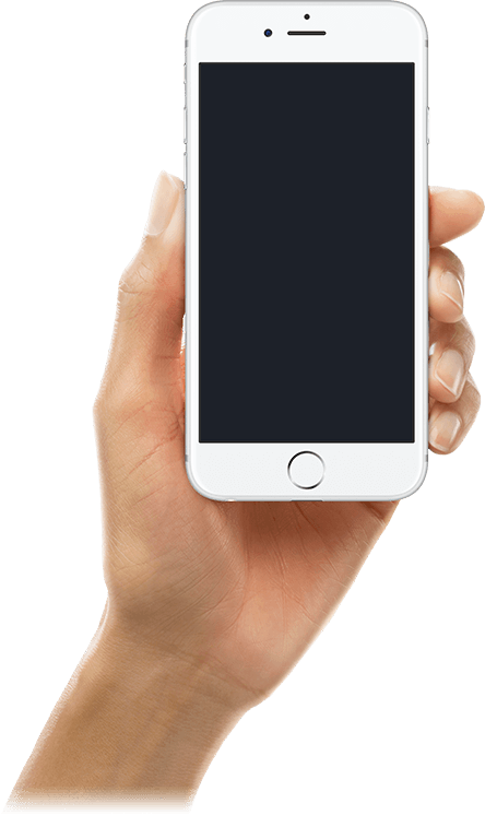
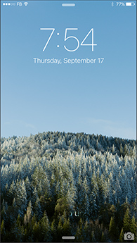
This full-screen block element shows an example from the real life: a hand takes a phone and switch it on. This can be used if you would like to introduce 4 important features symetrically, or highlight 4 relevant attribute of your product or service. The phone moves in a parallax way when you scroll on the site, so it will be visible all the time. The animations are build with inside to outside way, as the phone is in the absolute center of the screen. This technic is called from center to outside building.
Landing Screen 3
This slider shows the elements next to each other in a horizontal way. This layout is useful when you would like to make a step-by-step tutorial, or if you change the numbers to icons, you can also use it to show 3 features. A special rotational animation appears in the middle element, which is fully created by the Layer Slider.
Landing Screen 4
In this block the 3 main features are shown in a vertical-layout, and each built with an icon, a title and a description. A parallax effect is set for the phone when you scroll down, so you can show more content on that in a smaller place.
Landing Screen 5
This slider can be divided into two parts, there is a longer description on the left and image content on the right. It is the reverse of the previous slider. When you scroll down, the phones will slide over each other in an opposite way, which brings this block-element to life.
When you would like to have more blocks on your page with this layout type, it is good if you alternates between this and the previous block to make it varied and exciting.
Landing Screen 6
This is a simple testimonial block. Testimonials overcome skepticism. A good testimonial has the power to convince even your "tough sell" visitors that your product or service really made a difference in your customer's life and can help them, too. The more information about them is more convincing that the feedbacks are real, so show the people names, and pictures of them if possible.
Landing Screen 7
This slider is introducing a team with many possibilities to continue to build on. In this example we placed links on the images, which points to a Joomla article, now to their personal about pages, and opens them in pop-up mode. If you have 4 elements it is good if you place them symmetrically. On this slider the images placed in a 25% width blocks, and the text under each of them aligned to the center.
The important point of creating a slider that you need to make something unified. You should use similar animations, layouts and easings on all of the slides. It is also important that it should build around a conception, because that will lead the eye, and make a good (first) impression in your visitors.
Landing Screen 8
This block is also show team members but there is a small bio for all of them, too. It is always important to introduce the team of a project that there are real people behind that, because that makes the whole thing more personal. The block's background image has a parallax scrolling effect.
If there are more text on the slider it is important to be readable, so use light backgrounds under them.
